/01 — Custom build · 2026
Frenzy.
A brand studio's first real website — built from a blank file to look like the work itself: black, electric, and deliberately divisive. The color isn't decoration; it's the argument.
The brief
Make it impossible to ignore
Frenzy is a brand and identity studio — packaging, lettering, art direction, motion — and until now it had a sharp logo, a reel of fearless work, and no real website. This was a build from a blank file rather than a tidy-up of something old.
The brief was a dare: don't describe the work, be a piece of it. Loud, colorful, opinionated — and still fast enough that the attitude never costs an inquiry.
The argument
Color as commitment, not decoration
Every default in web design pulls toward safe — white space, a greige palette, one tasteful accent. For most businesses that instinct is right. For a studio that sells nerve, it would have been a polite lie about what Frenzy actually does.
So we made the divisive call on purpose: a saturated, high-contrast site that some visitors will bounce straight off — because the ones who stay are exactly the clients Frenzy wants. Playing it safe was the only real risk on the table.
The direction
Built from Frenzy's own palette
We didn't invent a look — we lifted Frenzy's. The ink-black ground, the acid-lime, the hot-pink that clashes on purpose, the oversized lettering: all of it comes straight from the studio's packaging and identity work. The site is a swatch of the portfolio.
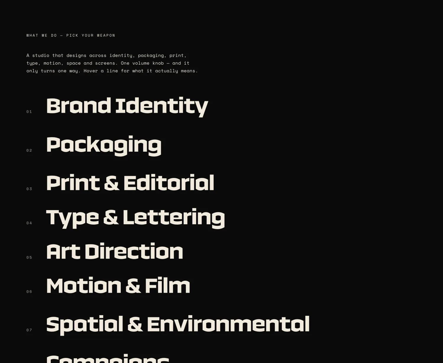
Color does the work most sites hand to boxes and borders. Services aren't tucked into cards or icons — they're a list set large, in the studio's own type, daring you to scroll past.
Voice & type
Copy that says it with its whole chest
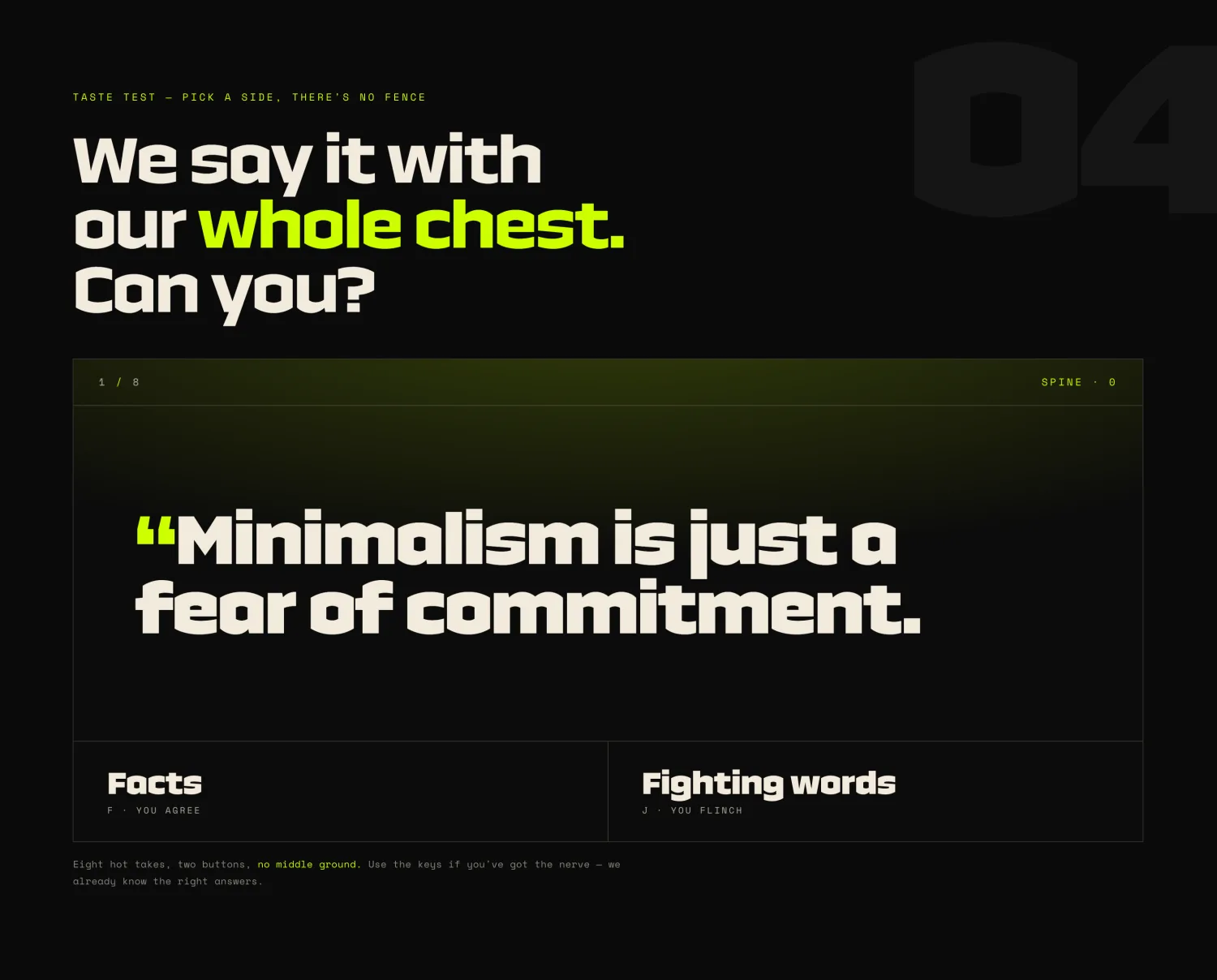
Frenzy’s confidence lives in the writing, so the type does the talking. Headlines argue with the visitor on purpose; a pull-quote section turns the studio’s opinions into the loudest thing on the page.
Clash Display carries the shouting — a nod to the studio's own lettering — a mono face handles the asides, and the spacing is tuned so nothing on the page feels polite by accident.
The build
Custom-coded, so nothing gets watered down
Every screen is hand-written HTML, CSS, and JavaScript with GSAP-driven motion — no page builder, no plugin stack to dull the edges or slow the load.
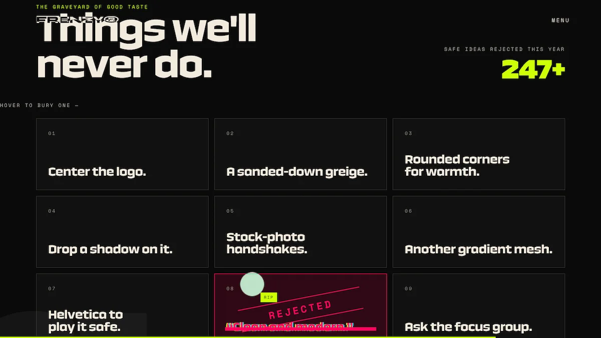
The ‘Things we’ll never do’ manifesto is the clearest example: a grid of opinions that would have been impossible to land inside a stock theme.
Impact
A site that filters as hard as it shouts
The color isn't just an aesthetic here — it's a filter. The site commits hard enough that the right clients lean in and the wrong ones leave, which is exactly the point.
Inquiries arrive from people who already want the bold version — so the first call starts with the work instead of a negotiation about taste.
“Minimalism is just a fear of commitment.”Frenzy — pulled straight from the homepage
/07 — By the numbers
9
services, set in type big enough to read across the room
0
templates, plugins, or stock photographs
2
clashing accents — acid-lime and hot-pink, on black
100%
custom-coded, with no template underneath
/08 — Stack
Stack & integrations
Everything on this project, end to end:
Too tasteful for your own good?
Tell us what you’d say if nobody flinched