/01 — Redesign · 2026
Hale & Crow
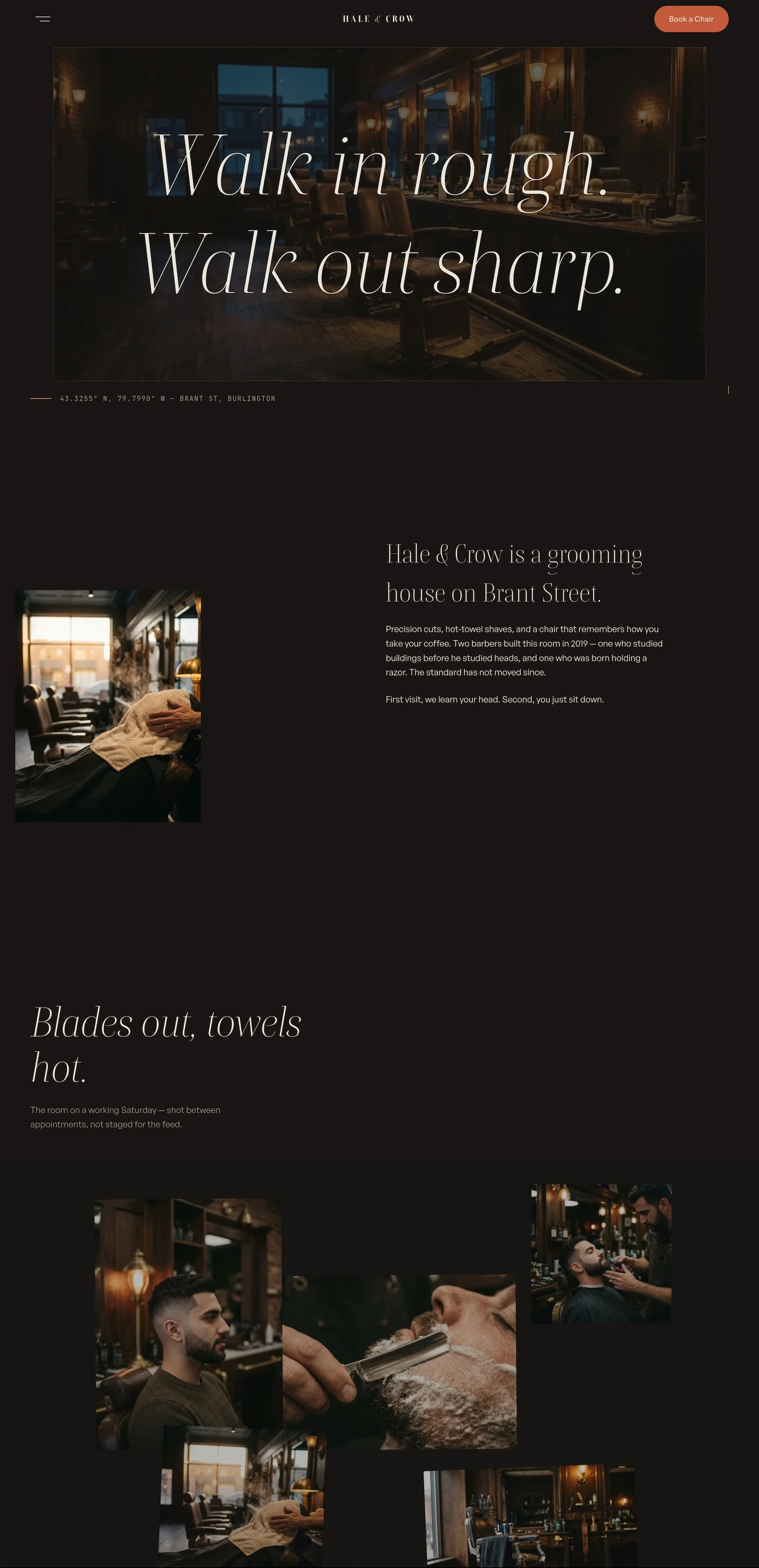
A grooming house in Burlington, Ontario, whose 2019 template site had been quietly telling customers the shop had closed — rebuilt as a dark walnut-and-brass site where the motion works the way the shop does: unhurried, precise, and finished with a single ember-red “Book a chair.”
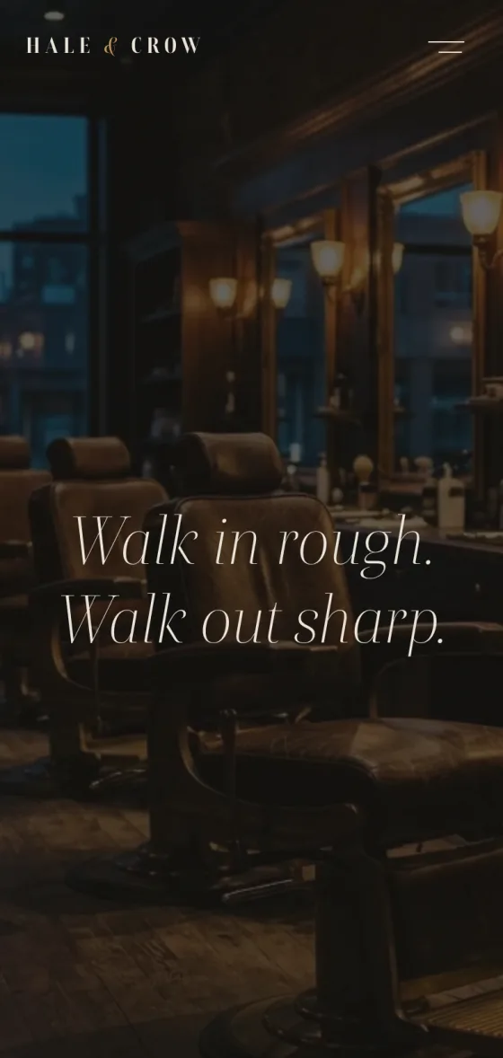
“Walk in rough. Walk out sharp.”Hale & Crow — the homepage's opening line
/02 — The brief
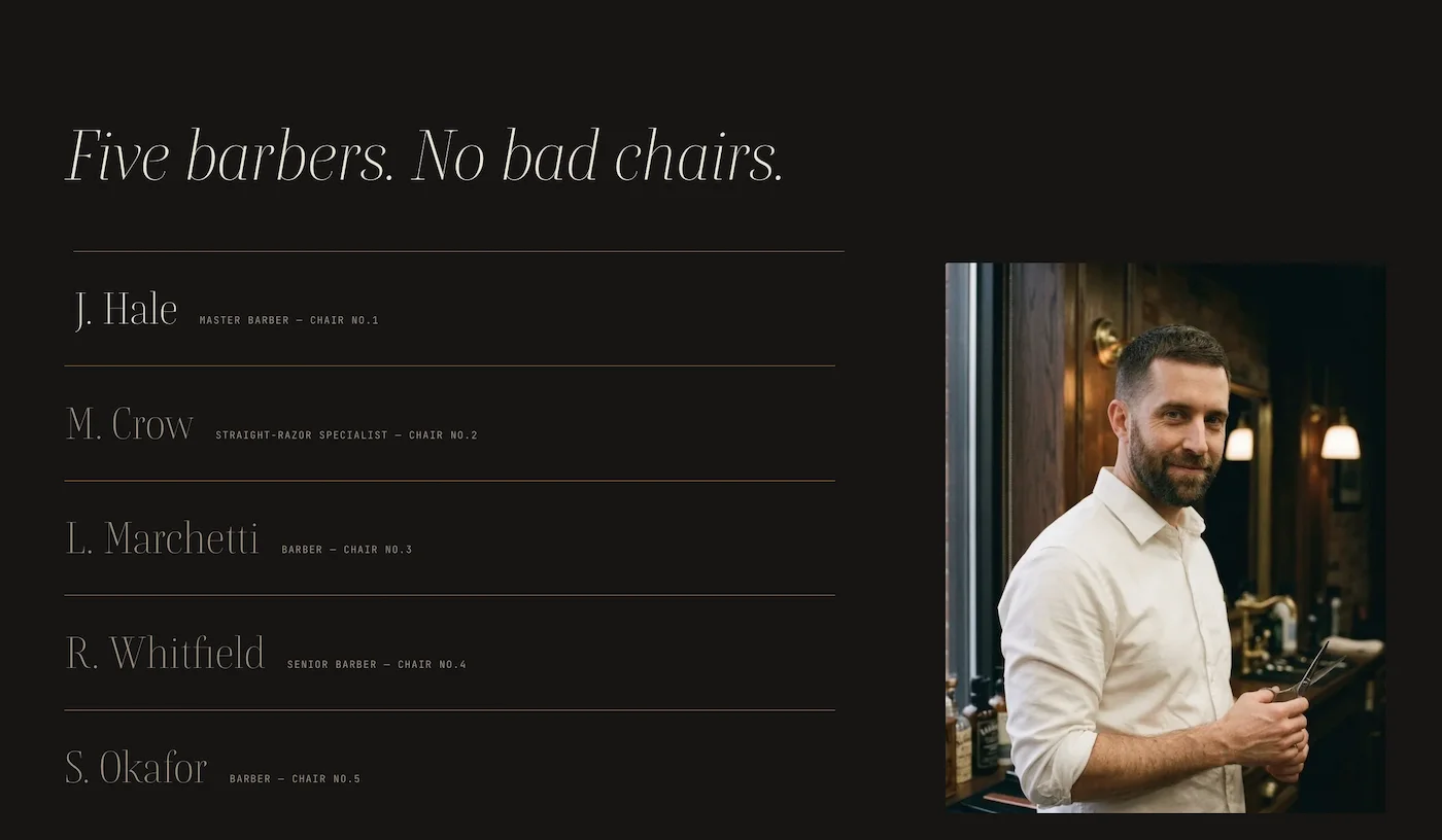
Six chairs, and a website working against them
Hale & Crow had everything a good shop needs: five barbers, a considered room, a service menu people recommend by name. It also had a template website built once in 2019 and left running — one that undid the impression the room makes, and a booking flow that lived entirely on the phone.
The brief was to rebuild the shop's character into a site that takes bookings seriously: no stock gloss, no chain-barbershop clichés, and nothing that would feel out of place next to the leather and walnut of the room itself.
/03 — The direction
Warm, dark, deliberate
The palette came from the shop itself: charred umber walls, smoked walnut panels, bone type, brass hairlines. Red appears exactly once per screen — the ember booking button — so the eye always knows where the appointment starts.
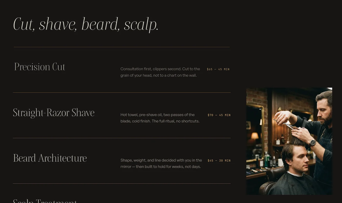
A serif with real italics carries the headlines, a quiet sans does the reading, and a mono face handles prices, chair numbers, and hours — the shop's paperwork, set in type.
/04 — Problem
The old site was costing them chairs
Hale & Crow already had a website. That was the problem. It had been assembled once, in 2019, and left running — and to anyone who found it, it read less like a barbershop than like a business that had stopped trading.
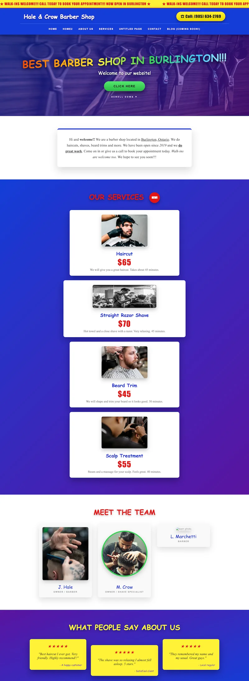
It read as closed
A banner still scrolled “NOW OPEN IN BURLINGTON” across the top. The blog had been “coming soon” for years. The navigation carried a Home2 and an Untitled Page the builder had never cleaned up, and the footer was stamped © 2019. Someone searching for a barber found a page frozen mid-setup and drew the obvious conclusion — the shop was gone. They never called to check.
The work was invisible
Every photograph was stock: other people's haircuts, in other people's rooms. The one real portrait — of a barber who still works the third chair — had broken, leaving an empty box captioned “team photo”. The testimonials were signed “A happy customer” and “Satisfied client”. Nothing on the page proved anyone had ever sat in it.
It priced the shop wrong
A $70 straight-razor shave sat under rainbow lettering and a green CLICK HERE button, on a purple gradient. The few walk-ins who arrived from the website expected a quick chop shop and found a room of leather and walnut where a cut takes the better part of an hour. The site set the wrong expectation before anyone opened the door.
There was no way to book
The only route to an appointment was the phone number in the header. It rings at the counter, staffed by whoever has both hands free — which, in a six-chair shop, is nobody. Calls went to voicemail during business hours, and after closing there was nothing at all: no form, no calendar, no way to commit at the moment someone decided to.
None of this was a design problem in the abstract. It was chairs sitting empty on a Tuesday because the website had told people not to come.
/05 — Motion
Scenes with a job to do
The site moves on GSAP and ScrollTrigger, with Lenis inertia running off the same ticker — so every scene reads as one continuous gesture rather than a stack of effects. Almost everything is scrubbed to the reader's own scroll: the opening photograph grows from an inset frame to full bleed, headlines rise out of line masks ninety milliseconds apart, and the service menu pins and stacks like a deck of cards being squared.
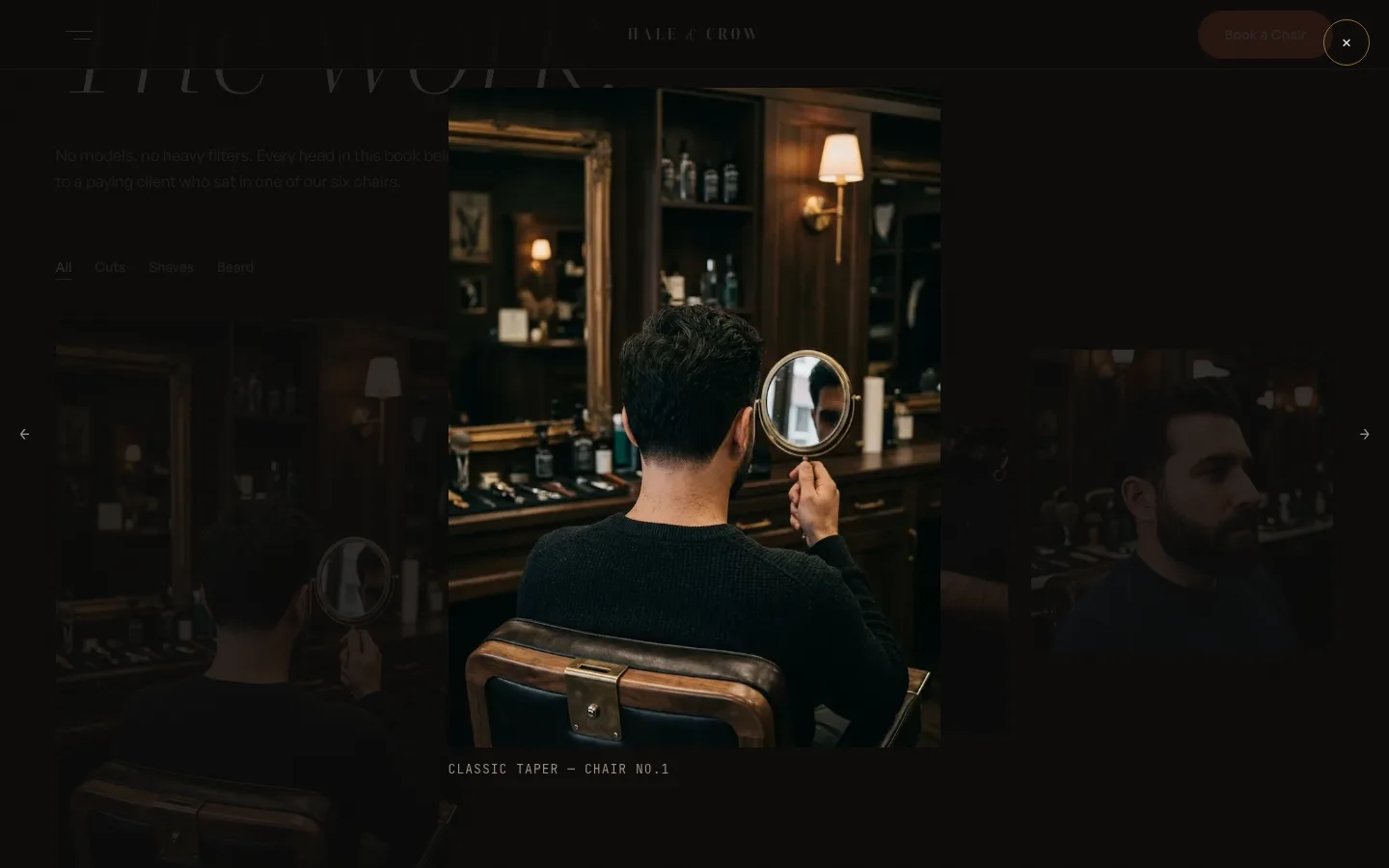
The showier moments are rationed to where they earn their keep. Gallery shots drift apart on randomized vectors and reassemble on the way back up; chair panels rotate a literal 180° to tell each station's story; and the lookbook reshuffles with FLIP measurements, its lightbox opening out of the thumbnail you clicked.
All of it is guarded. prefers-reduced-motion collapses the site to a fully readable static page, the pinned and 3D scenes require desktop widths, and nothing animates except transform, opacity, and clip-path — with will-change applied only while a scene is live.
Arrival
A once-per-session preloader counts 000→100 and lifts a clip-path curtain — never past 1.4 seconds.
Scroll scenes
The pinned set pieces: hero clip-zoom, the service deck, the chair flips — all scrubbed, all reversible.
The lookbook
FLIP-driven filters and a lightbox that animates out of its own thumbnail, under a custom VIEW cursor.
Signatures
A magnetic ember CTA, a brass progress line, portrait crossfades, and a live Burlington clock in the footer.
/06 — Booking
Booking, end to end
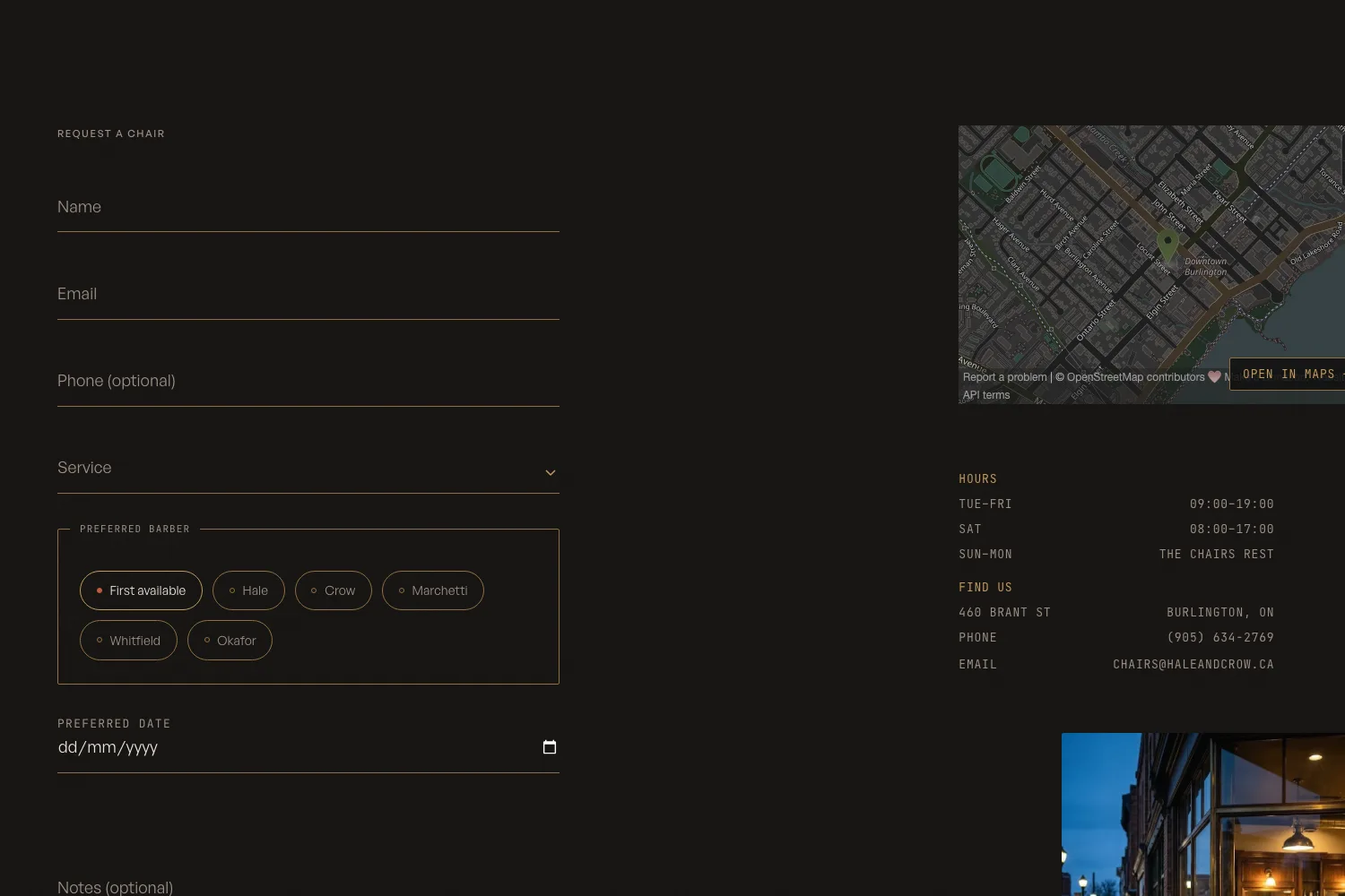
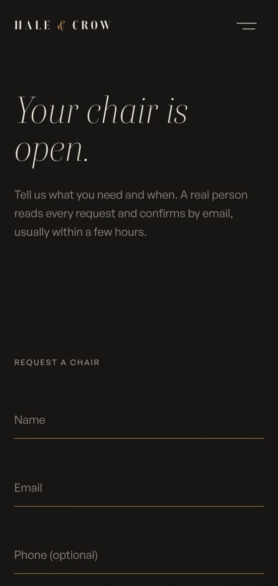
The whole site funnels to one page: Book a chair. The form asks exactly what the counter would — name, contact, the service with its price in the label, a preferred barber, a preferred date, and notes — and makes a promise the shop can keep: the next opening, usually within 48 hours.
Behind it sits a small hand-written PHP endpoint — no framework, no plugin stack. It re-validates everything server-side (mirroring the client-side checks), sanitizes the payload, and drops bots with a honeypot field and a submit throttle before a single email is sent.
Clean requests are mailed to the shop's inbox with the service, barber, and date already structured, and the client gets an SMTP confirmation with reply-to set to the shop — so a barber can answer personally with one keystroke. If mail delivery ever fails, the form degrades to the phone number instead of a dead end.
Booking pipelineProduction
- 01POST to book.phpOne hand-written endpoint — no framework, nothing to patch monthly.
- 02ValidateRequired fields, email and date sanity — server-side, mirroring the front end.
- 03Sanitize & screenTrimmed, encoded payload; honeypot field and submit throttle drop the bots.
- 04Notify the shopThe request lands in the shop inbox with service, barber, and date structured.
- 05Confirm to the clientSMTP confirmation with reply-to set to the shop — one keystroke to answer.
- 06Fail softIf mail is ever down, the form surfaces the phone number — never a dead end.
/07 — The rest of the house
One hand, every room
A five-page site only works if the fifth page is built with the same care as the first. The House and The Work carry the shop's story and its proof — and the whole build keeps its manners when the screen shrinks.

The House — the story, told in scenes
The page opens on a full-bleed photograph that settles into a frame — the homepage zoom, mirrored — then walks the visitor through story bands with opposing parallax, a brass timeline that draws itself down the page, and the chair panels that flip to introduce each station. It's the page that sells the room, so the pacing is slowest here on purpose.
The Work — the proof, filterable
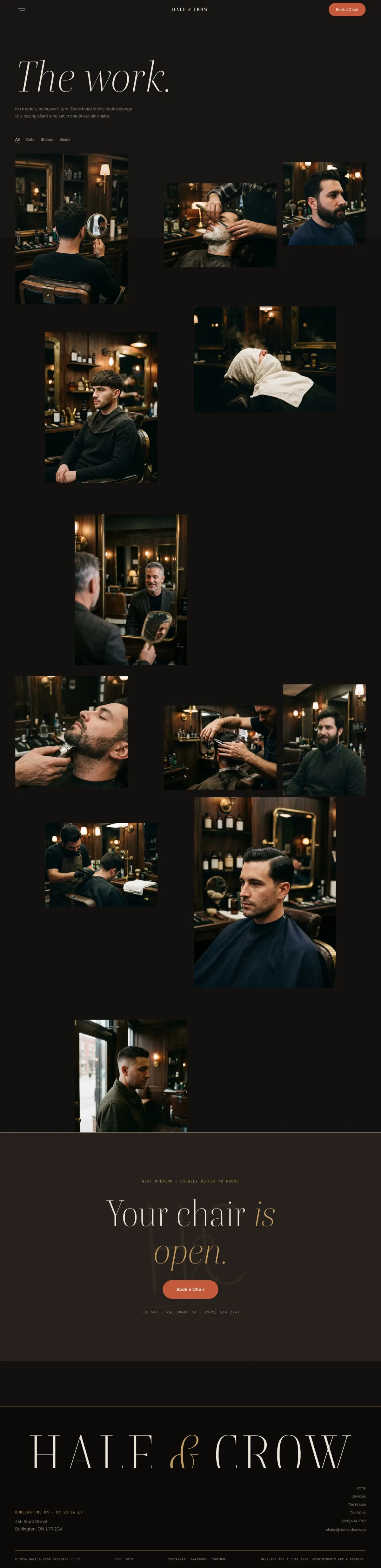
The lookbook is the shop's receipts: cuts, shaves, and beard work in one grid, filterable by category, every photograph gliding to its new slot instead of snapping. Each shot opens full-screen from its own thumbnail — close enough to judge the fade line, which is exactly the confidence a booking needs.
On phones, the set pieces step aside rather than shrink: the service deck unstacks, the chair flips become plain captions, and the ember button stays within a thumb's reach on every screen. The site loses motion before it ever loses meaning.
/08 — Result
A site that holds the chair
The rebuild reads like the room: dark, warm, and exact, with one ember button on every screen and nothing competing with it. The motion earns its place — it sets the shop's pace instead of showing off — and collapses cleanly on phones and for anyone who asks for less.
Most importantly, bookings now arrive as structured requests — service, barber, date — instead of voicemails, so the counter spends its time cutting hair, not playing phone tag.
And the question the old site kept raising — whether Hale & Crow was still open — no longer comes up.
/09 — Stack
Stack & integrations
Everything on this project, end to end:
If your week runs on bookings, start here.
Send your current site — we'll map the booking flow first