Oak & Furniture
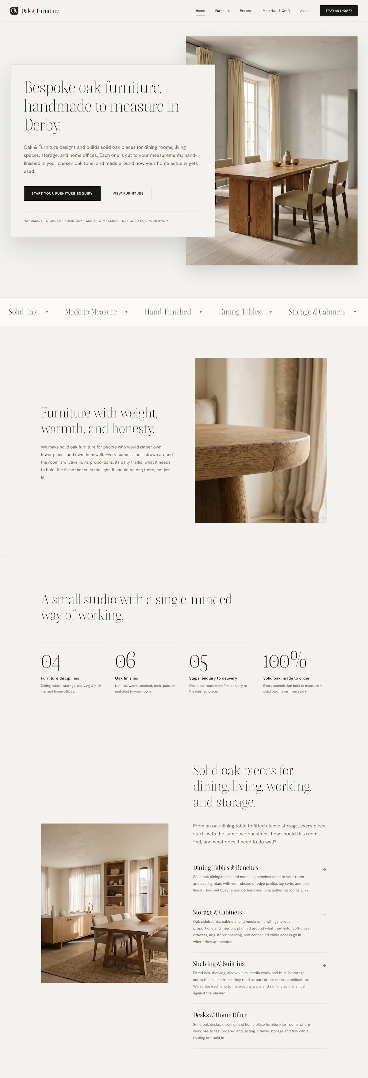
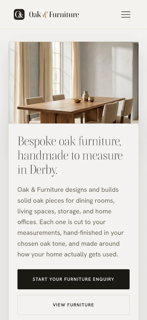
A bespoke furniture maker whose old site hid the work behind stock photos and dense text — rebuilt by hand to lead with the pieces and the rooms they are made for.
/01 — Problem
A catalog no one could see
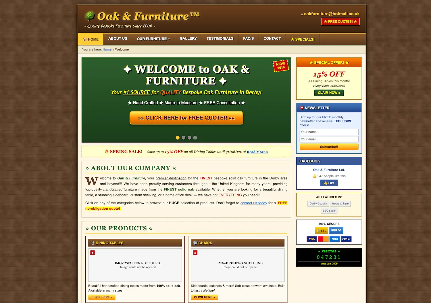
The old site opened on a generic banner and buried the finished pieces several scrolls down. For a workshop whose whole case is the quality of its work, the work was the last thing a visitor met.
Everything about it announced its age. A tiled brown background framed a boxed, fixed-width layout; a clip-art tree sat beside a gold-gradient wordmark; and a green banner welcomed visitors in sparkles above an orange “CLICK HERE for FREE QUOTE!!” button. The sidebar found room for a newsletter box, a Facebook widget, payment badges and a visitor counter — everything except furniture.
The work itself never loaded. Under “Our Products”, the two photographs that should have shown a dining table and a set of chairs had been broken long enough that the page simply read “IMG-32577.JPEG NOT FOUND”. Beneath them a spring sale still offered 15% off until 31/06/2010 — a discount years expired, on a date that has never existed.
There was no clear way to start a commission either — just a plain contact form that gave the workshop none of the room details it needs before it can quote.
/02 — Approach
Lead with the pieces, group by the room
Buyers arrive to do three things: see finished work, find the kind of piece they need, and ask what a commission would cost. The new structure puts each one near the top, with the photography doing the talking.
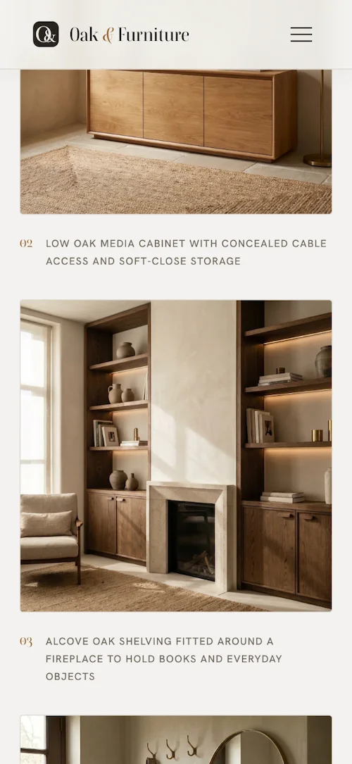
Pieces are grouped the way people actually think — dining tables and benches, storage and cabinets, shelving and built-ins — each with real photographs of completed work rather than catalog renders.
The whole site is hand-written HTML, CSS, and JavaScript, with a small PHP endpoint behind the commission form — no theme, no page builder, nothing to slow it down or patch later.
/03 — Result
The work comes first, and feels considered
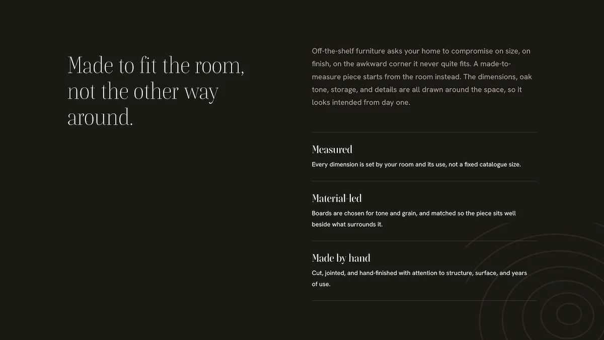
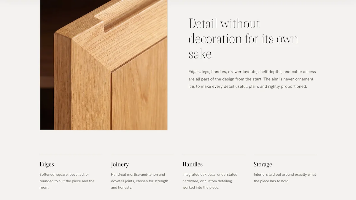
The redesign loads fast and reads with ease — the pieces lead, the copy is short and specific, and a commission starts with the room details the workshop needs to answer well.
The result looks like the furniture: warm, restrained, and built with care — a site the maker is happy to send a prospective client to.
/04 — Stack
Stack & integrations
Everything on this project, end to end:
Got work worth showing properly?
Send your current site — we'll tell you what we'd lead with